Visual hierarchy in five minutes: a checklist for every screen
A practical checklist our mentors use in every critique.
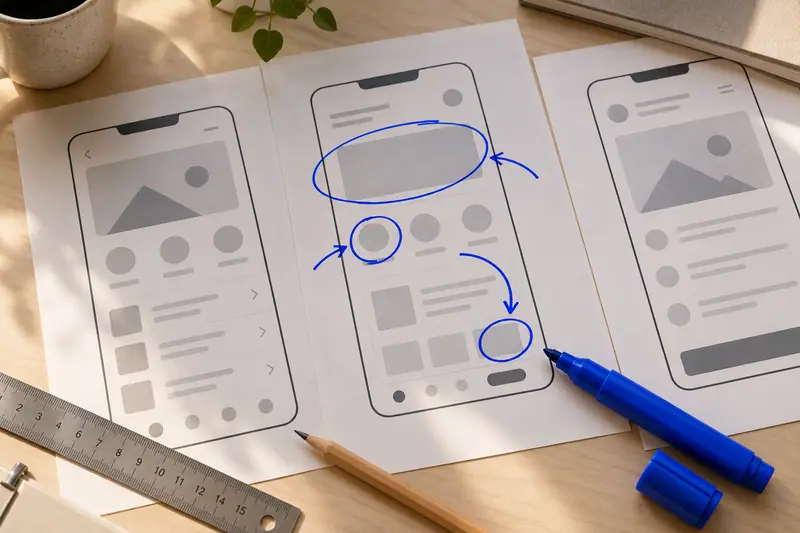
When a screen feels wrong but you cannot say why, the problem is usually hierarchy. Here is the five-minute checklist we use in every critique.
- Squint test: what do you see first, second and third?
- One primary action per screen, visibly stronger than the rest
- Group related items with space before you reach for lines and boxes
- Use at most three text sizes on a mobile screen
- Check contrast for every text style, not only body copy
Run it before you ask for feedback. Your mentor can then spend the critique on the interesting problems instead of spacing.
A worked example
Take a checkout screen with a promo banner, a carousel and two equal-weight buttons. Squint and you see the banner first, which is the opposite of what the business wants. Shrink the banner, remove the carousel and make the pay button the only filled element. Nothing was added, and the screen got clearer.
Three mistakes we see every cohort
Using colour as the only signal of importance, adding a fourth text size to fix one awkward label, and boxing every group instead of giving it room. Fix spacing first, size second, colour last.
Want feedback on your own work?
Join the free portfolio webinar: a live teardown of three student case studies.